UI Design
UX
October 2, 2024
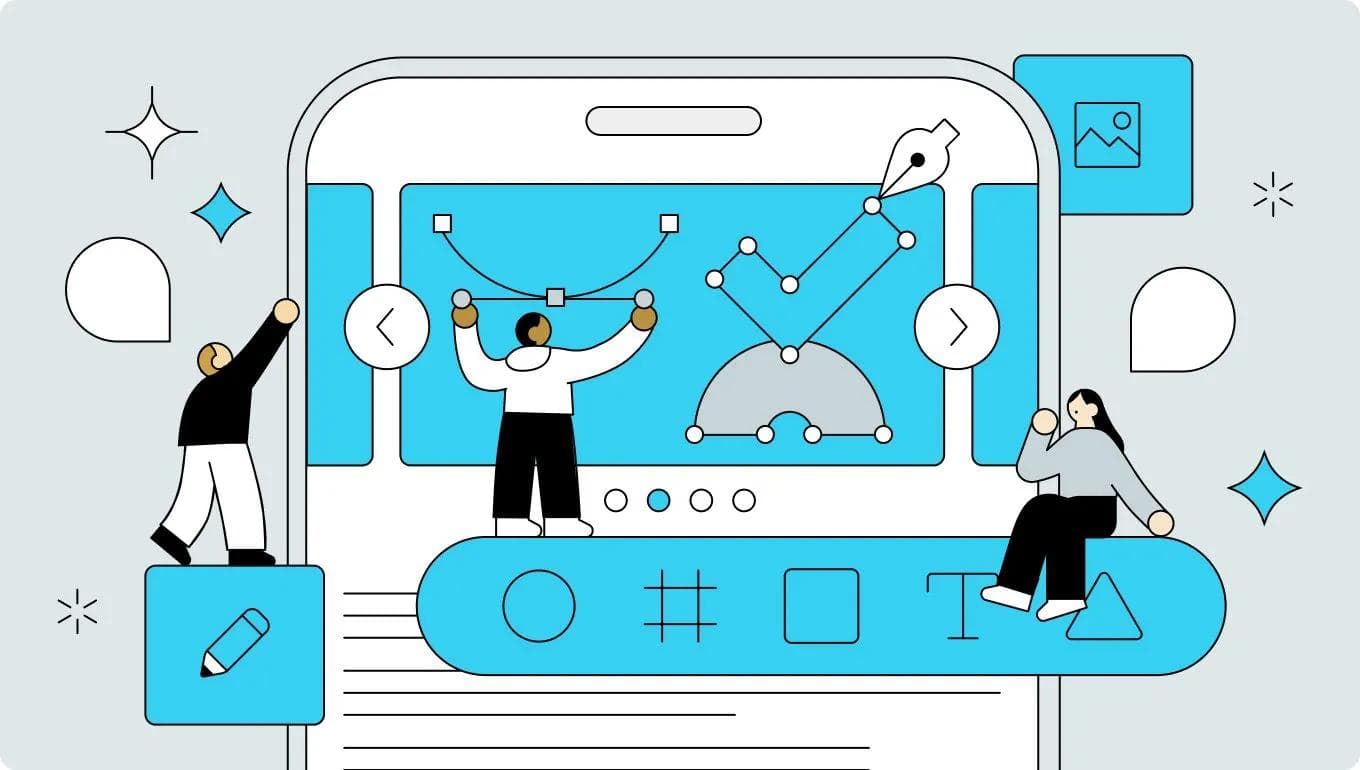
UI Design Checklist 2024 for Improving Product Usability (Part1)
UI design case studies based on heuristic analysis, WCAG, and other theories

Uni
UX/UI Designer

Having spent almost 9 years working as a UI designer, I've discovered that a system of theoretical rules and principles is mostly responsible for determining a product's usability and level of satisfaction. Trends, eye-catching visuals, and distinctive design aspects work well to define a product's personality and draw in customers. However; trends change with time and the tastes of consumers and clients determine how art should be judged.
Conversely, theoretically informed UI design choices can effectively enhance a product's usability, increasing its value and eventually bringing user satisfaction. The 10 usability heuristics for user interface design were proposed by Jakob Nielsen in 1994. They are components of a list of principles standardizing the creation of intuitive and user-friendly designs, and are still used by many designers today. Let's take a closer look at how these heuristics help guide designers in creating modern, user-centered products with specific case studies.
10 General Principles for Interaction Design
Jakob Nielsen's 10 general principles for interface design are as follows.
- Visibility of system status
- Match between system and the real world
- User control and freedom
- Consistency and standards
- Error prevention
- Recognition rather than recall
- Flexibility and efficiency of use
- Aesthetic and minimalist design
- Help users recognize, diagnose, and recover from errors
- Help and documentation
In this article;
1: Visibility of System Status
"The design should always keep users informed about what is going on, through appropriate feedback within a reasonable amount of time."
- https://www.nngroup.com/articles/ten-usability-heuristics/
What it Means:
When users know the current system status, they learn the outcome of their prior interactions and determine next steps. Predictable interactions create trust in the product as well as the brand.
Best Practice:
- Progress indicators: Show loading bars, spinning icons, or timers to indicate system activity.
- Notifications: Use in-app or push notifications to keep users aware of ongoing processes, especially for background tasks.
- Status updates: If an action takes longer than expected, keep the user informed with periodic updates or estimations of completion time.
1-1. Separate steps when there are many input items
Group the fields on your form to divide the screen if it includes a lot of input fields. Users may give up and leave your page if your form is too lengthy. Next, install a stepper or progress bar to create a visual representation of the progress a user has made through a form. By showing you how far you still have to go to finish, a stepper helps you stay motivated by allowing you to track your progress continuously.

1-2. Clarify the status during narrowing down
Make it apparent on the screen where the search results are displayed; even if the filtering conditions are not specified.
Filtering expressions that can be used include:
- Showing the number of filter conditions.
- Changing the filter button's color.
- Showing the filter conditions as chips.
- Presenting the textual filtering conditions.

1-3. Display empty state
First-time users may find an app or website empty, meaning it contains no data or content—a state known as the "Empty State." The user will be bewildered and unsure of what to do if all they see is a blank screen. By making it apparent to the user what this screen is for, that no content is available, and how to display the content, you may avoid user confusion.

1-4. Display feedback close to user actions
Feedback on user actions may go unnoticed if it appears in a remote location. Display feedback near the action when a state changes, such as when a download begins or an upload completes.

2: Match Between the System and the Real World
"The design should speak the users' language. Use words, phrases, and concepts familiar to the user, rather than internal jargon. Follow real-world conventions, making information appear in a natural and logical order."
- https://www.nngroup.com/articles/ten-usability-heuristics/
What it means:
Design interfaces using language, icons, and visual elements that users can easily relate to from their everyday experiences. Avoid technical jargon and use real-world metaphors to create familiarity and reduce cognitive load.
Best Practice:
- Language: Write copy in the language your users speak. Avoid complex terminology unless it’s essential to the audience.
- Real-world metaphors: Use icons like envelopes for email or trash bins for delete to draw from users’ physical world understanding.
- Natural sequencing: Ensure that workflows follow a logical, real-world sequence that users can predict.
2-1. Use language that is easy for users to understand
When using words in services and products, use words that can be understood by users, not from a programmer's perspective. Words such as "The input content is invalid," "Authentication failed," and "Failed to obtain information" are written from a program's perspective, so they cannot be considered useful information for the user. Use words that users can understand when they see them, such as "Please create your password with a combination of at least 6 letters or numbers."

2-2. Use language in button/link text that clearly describes what happens when you press it.
The text is the main element that explains the purpose of the button. Text should be clear, predictable, and simple. Start with a verb that calls to action. The verb should tell the user what will happen when they click the button and allow them to predict the next step. Use simple language that all ages can understand.
"Forward," "Continue," and "OK" are examples of words that don't make it clear what happens when you push the button. Because they are unsure of what would happen when they hit the button, users could be reluctant to do so. Describe actions that truly happen when the button is pressed, such "send" and "confirm input," to make it obvious to the user what will happen when they touch it.

2-3. Make the language on the button a verb.
For buttons such as modals, use labels that prompt the user to take an action, such as "save" or "delete," rather than "OK" or "yes," and indicate the action that will be performed when the button is pressed. Also, avoid using the word "cancel" in the modal description, such as "Are you sure you want to cancel...?" Cancel is often used as a negative button, so avoid confusing questions.

2-4. Consider regional differences in date notation
Dates are culturally dependent, which can present considerable issues for users who are used to a different format. "10/11/2016" may indicate October 11, 2016 in one place but November 10 in another. When showing dates for people all around the world, it is easier to distinguish them from days by include the name of the month. It also communicates clearly with translators.
The hyphen ( - ), period ( . ), and underscore ( _ ) are not commonly used date symbols and should be avoided. Also, when multiple dates are listed in a business system, etc., use zero-padding (adding zeros to the beginning of a number) to prevent the number of digits from being out of alignment.

3: User Control and Freedom
"Users often perform actions by mistake. They need a clearly marked "emergency exit" to leave the unwanted action without having to go through an extended process."
- https://www.nngroup.com/articles/ten-usability-heuristics/
What it means:
Users should feel in control of their experience, with the ability to undo or redo actions, and exit tasks at any point. Having escape routes prevents users from feeling trapped by the system.
Best Practice:
- Undo/redo options: Allow users to backtrack or recover from mistakes without restarting the entire process.
- Clear exit points: Provide visible and accessible “Cancel” or “Back” buttons in forms, modals, or processes.
- Confirmation dialogues: Before critical actions, like deleting files or submitting irreversible information, ask for confirmation to prevent accidental errors.
3-1. Always allow users to control actions
Users may make mistakes, change their minds, or press buttons out of curiosity. So, give users control over the system at any time by creating a flow path that allows them to quickly correct mistakes or redo their choices.

3-2. Set buttons to the carousel in addition to dot indicators
The dot indicator is effective for indicating the position of the currently displayed content, but it is not very suitable for switching content because it is small and difficult to click. Carousels should not only have dot indicators, but also buttons for sliding content.

3-3. Make it clear that cards/lists are clickable
Similar to buttons and links - if it is clear that cards and lists can be clicked without having to hover the mouse, the user can decide the next action without hesitation. To achieve this, add shadows to create depth, etc. You can tell users that there is a transition destination by adding an arrow icon to the list item.

3-4. Guide users past the scroll
If you want users to scroll through your content, they may not realize that they can scroll if the break in your content is aligned with the edge of the screen. Adjust the position of content as such that images and text appear as if there is a continuation of the content off the screen and encourage scrolling in that direction.

If you are interested in the continuation, you can read part 2 of the article through this link here.
Uni
UI Design Checklist 2024 for Improving Product Usability (Part3)
UI design case studies based on heuristic analysis, WCAG, and other theories.
Uni
UI Design Checklist 2024 for Improving Product Usability (Part2)
UI design case studies based on heuristic analysis, WCAG, and other theories
Uni
3 Ways for UI Designers to Make Original Illustrations into SVG Animations
A case study of animating original characters using Figma, After Effects, or Lottie Creator tools